I want to preface the rest of my comments by the following disclaimer: I am not a financial professional -- I leave all serious finance stuff to my talented MBA wife. My approach to economic issues can be summed up by this XKCD comic:
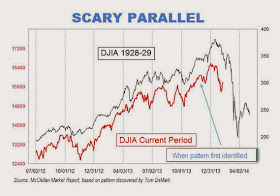
With that out of the way, let's continue. Aside from the fact that the Dow Jones Industrial Average is stupid, there are lots of people commenting on the two-scale axes thing. See here or here, for example. Their basic complaints are that it's not fair to compare the two sets of data because they are scaled to overlay. This is what they look like on the same scale. The red portion is the scary part leading up to the crash:
A little more clarity can be seen graphing these on a log scale:
In any case, this is where my lack of economic knowledge comes in -- I have no idea if that's a good argument or not. But, the graph is still nonsense. First of all, that graph is especially bad, since they didn't scale things correctly and also left out the range of dates used for the 1928-29 dataset. I've done my best to replicate and correct it:
Here, the past and current DJIA values are scaled to fit in the same window. As you can see, there is quite a lot of overlay between the pre-crash data and current data... so perhaps it is scary?
Second of all, and more importantly, I suspected that there were lots of times when the market looks like it does now. So, I wrote a program to go through every 84 week hunk of Dow data and compare it to the current period. This is a graph of the norm of the difference between past periods and the current period:
As you can see, there are many times where the difference drops and there is a time where the Dow's behavior is similar to the current one. In fact, the time with the closest overlap began March 16, 1954:
In other words, this point:
In other words, EVERYONE PANIC!!! Oh... wait... maybe not. The thing is, people see patterns everywhere, even when they don't exist. To show you what I mean, I made this video:
There's a LOT of self-similarity in the Dow Jones Industrial Index, so it's not surprising that some arbitrary hunk of time-series data looks like another arbitrary hunk. But there is nothing "eerie" or scary about it.


No comments:
Post a Comment