Monday, February 24, 2014

DIY Smartphone to Microscope Conversion

Last weekend I made a microscope out of my android phone; I was surprised how well it worked.

I wrote up a pretty long description of the project and some directions here: smartphone microscope. I'm just going to put some of the best photos here now, but click the link above to get the full descriptions.


Phone microscope

Red onion cells


Bromeliad cells

Thread puff


Salt under a microscope

toothbrush under a microscope

toothbrush under a microscope


Phone microscope


Tuesday, February 18, 2014

Continued Winter Exploits

As I have established in some prior posts, here and here, winter in southern CA isn't all that harsh.  In fact I took a picture of my outside thermometer Monday afternoon.
Just shy of 70 degrees Fahrenheit and about 60% humidity.

I used this nice weather to install a hummingbird feeder, I will keep you updated if I see any hummingbirds (I have seen them on bird of paradise flowers in my area).

Here are some of the plants I have out on my balcony.  In the forefront you can see my strawberries (lots of strawberries in southern CA).  Then I have two rosemary plants, the one in the middle is a ground crawling one designed for ground cover and is currently flowering.

A close up of the rosemary flowers, with a basil plant behind it.

Monday, February 17, 2014

MAC Space Background Badly Photoshopped, Part 1/?

I recently started using a MAC at work, naturally I chose the background image which has something to do with space.

But the more I looked at it, the more it bugged me, I didn't know why - and then it hit me - it was totally faked. Those artsy people at Apple computers couldn't find a single real photograph to use from the universe of breathtaking space photography and so they made their own instead.

Here is what a moonrise from space looks like in real life. This photo was taken by an Expedition 29 crew member aboard the ISS.

Lets notice a few things about the MAC artistic interpretation of a moonrise from space:

  • The stars. Look at any of the photos that include earth or the moon from the apollo missions and you won't see any stars. Certainly not a fairy tale splattering of stars probably cut and pasted from a Disney movie.
  • The moon looks perfectly circular. When looking at the moon through the atmosphere it is going to look at least a little distorted. This happens on earth too so no big surprise there. The color should also change.
  • The sky is super blue.... not once you get to space; then the sky is black, it doesn't do that 'gradient' thing for very long.
  • The dark side of the moon is light. This isn't even that big of a deal compared to all the stars that are shining out there, but in real life you wouldn't see the light of earth's albedo on the shadowed side of the moon in the same picture that you see the full-on daytime sunlight on the adjacent side. This basically means that they took a photo of a full moon and randomly added some shading to it. I wouldn't be surprised if the angle is completely impossible (knowing the latitude of the earth photo would help to calculate that).
  • The whole picture looks too blue IMHO. Don't have anything scientific to say about it other than that.
  • The moon's proportions look off (a telephoto lens? Then the earth below would look more distorted).
To end, lets remember the time that Aryeh sent a balloon to the edge of space and took this picture. You don't need to be an astronaut to know what an earth/space boundary looks like.


Thursday, February 13, 2014

The 1929 market chart is not scary!

The Wall Street Journal's MarketWatch blog recently posted an idiotic chart comparing the behaviour of the Dow Jones Industrial Average in the months leading up to the stock market crash of 1929:

I want to preface the rest of my comments by the following disclaimer: I am not a financial professional -- I leave all serious finance stuff to my talented MBA wife. My approach to economic issues can be summed up by
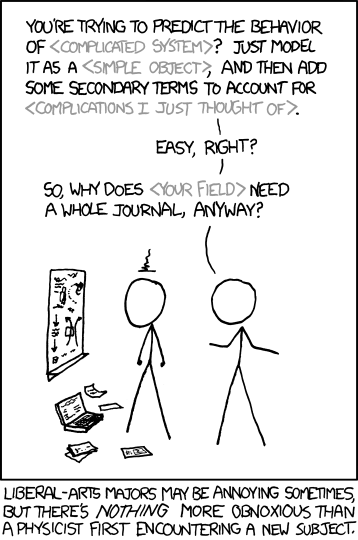
 this XKCD comic:

With that out of the way, let's continue. Aside from the fact that the Dow Jones Industrial Average is stupid, there are lots of people commenting on the two-scale axes thing. See here or here, for example. Their basic complaints are that it's not fair to compare the two sets of data because they are scaled to overlay. This is what they look like on the same scale. The red portion is the scary part leading up to the crash:
A little more clarity can be seen graphing these on a log scale:


In any case, this is where my lack of economic knowledge comes in -- I have no idea if that's a good argument or not. But, the graph is still nonsense. First of all, that graph is especially bad, since they didn't scale things correctly and also left out the range of dates used for the 1928-29 dataset. I've done my best to replicate and correct it:
Here, the past and current DJIA values are scaled to fit in the same window. As you can see, there is quite a lot of overlay between the pre-crash data and current data... so perhaps it is scary?

Second of all, and more importantly, I suspected that there were lots of times when the market looks like it does now. So, I wrote a program to go through every 84 week hunk of Dow data and compare it to the current period. This is a graph of the norm of the difference between past periods and the current period:
As you can see, there are many times where the difference drops and there is a time where the Dow's behavior is similar to the current one. In fact, the time with the closest overlap began March 16, 1954:
In other words, this point:
In other words, EVERYONE PANIC!!!   Oh... wait... maybe not. The thing is, people see patterns everywhere, even when they don't exist. To show you what I mean, I made this video:
There's a LOT of self-similarity in the Dow Jones Industrial Index, so it's not surprising that some arbitrary hunk of time-series data looks like another arbitrary hunk. But there is nothing "eerie" or scary about it.

Monday, February 03, 2014

Falling water west of Boston

I've been on a bit of a mission lately. Last weekend I visited a highway through a forest. This weekend I went around exploring various waterfalls near where I live. They will hopefully be tied together for you over the next few weeks.

This one is at the edge of the WhiteHall Reservoir

The sudbury river and Framingham reservoir number one


Village Falls Park, Needham MA. This is actually the Charles River that runs through Boston, just much further upstream.