
The old Google left no pixel un-turned in their zealos march to higher screen utilization. They innovated ways that seemed impossible, like saving 5-10 pixels of space by doing away with the historic windows bar that all old-fashioned programs have at the top of each window. They shaved a few pixels more with extra-thin scroll bars and other tricks that worked so well they soon became industry standard. All of those efforts are wasted by the new user interface designs.
As an example, see my screenshot of Google books below.
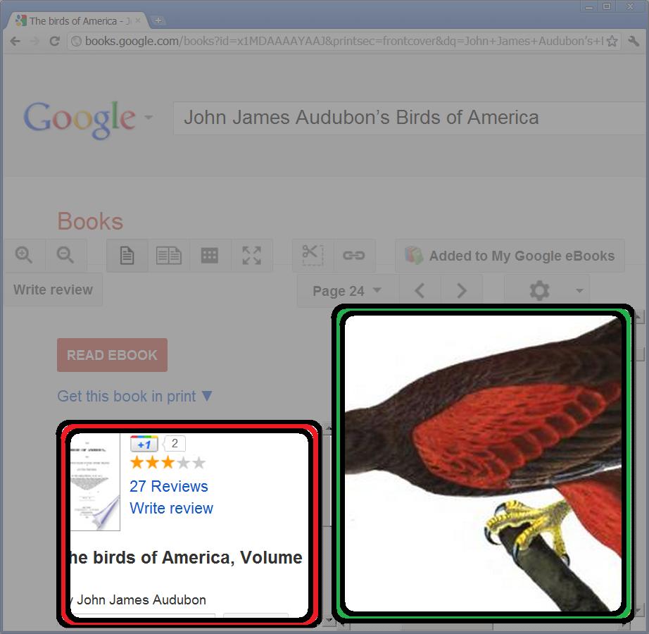
Notice that the actual page of the book is about 1/4 the total available screen area, while the description of the book gets a little more than 1/8 of the screen. You can set the page to "full screen" but even then half the screen is still wasted by all that vertical whitespace. What is really preventing you from increasing the amount of screen you can use is a trick from the old days of the web, called Frames.

Without too much trouble, I demonstrated with a geometric proof that there is far more blank whitespace on the screen, than there is actual book. Honestly I think it is nothing less than tragic for this to happen on what used to be the screen-saving hero of the Internet.

- Login, click the gear in the upper right corner
- Select "Report a bug"
- Highlight some unnecessary whitespace
- Preview -> submit
http://support.google.com/books/bin/request.py?hl=en&contact_type=survey
See my feedback below:
Google books has recently implemented Frames with wide wide vertical margins in the Google books page. This is a huge problem because frames are confusing to navigate and they hog precious screen space.Know any other ways to give feedback? Post in comments.
Please revert back to using modern designs rather than frames, that horrible monster slayed towards the end of the wild-west days of the internet.

It's not that dire in Chrome on my computer. There is wasted whitespace, but not nearly as much as your picture. The wasted greyspace in full screen mode is more of a problem, but that has to do with monitors being wider than tall, and book pages taller than wide.
ReplyDeleteThe difference is probably because I have mine set to a very large font size and my laptops monitor is not so big. Try making the fontsize larger ...
ReplyDelete